


Morphea — Brand identity
An identity that shapes rest.
For Morphea, a mattress brand, we developed a brand identity inspired by the world of dreams. From the name to the logo, from the color palette to the applications, every element was designed to convey comfort, tranquility, and elegance.
The goal: to make the brand recognizable through an identity capable of expressing its promise, “Sleeping well is living better.”.
Naming and inspiration
The name Morphea recalls Morpheus, a mythological figure associated with sleep and dreams. The soft, harmonious sound evokes rest and well-being, introducing a welcoming and refined brand universe.
This inspiration guides the entire project, creating a link between the name, the graphic sign and the brand message.
A logo between dream and lightness
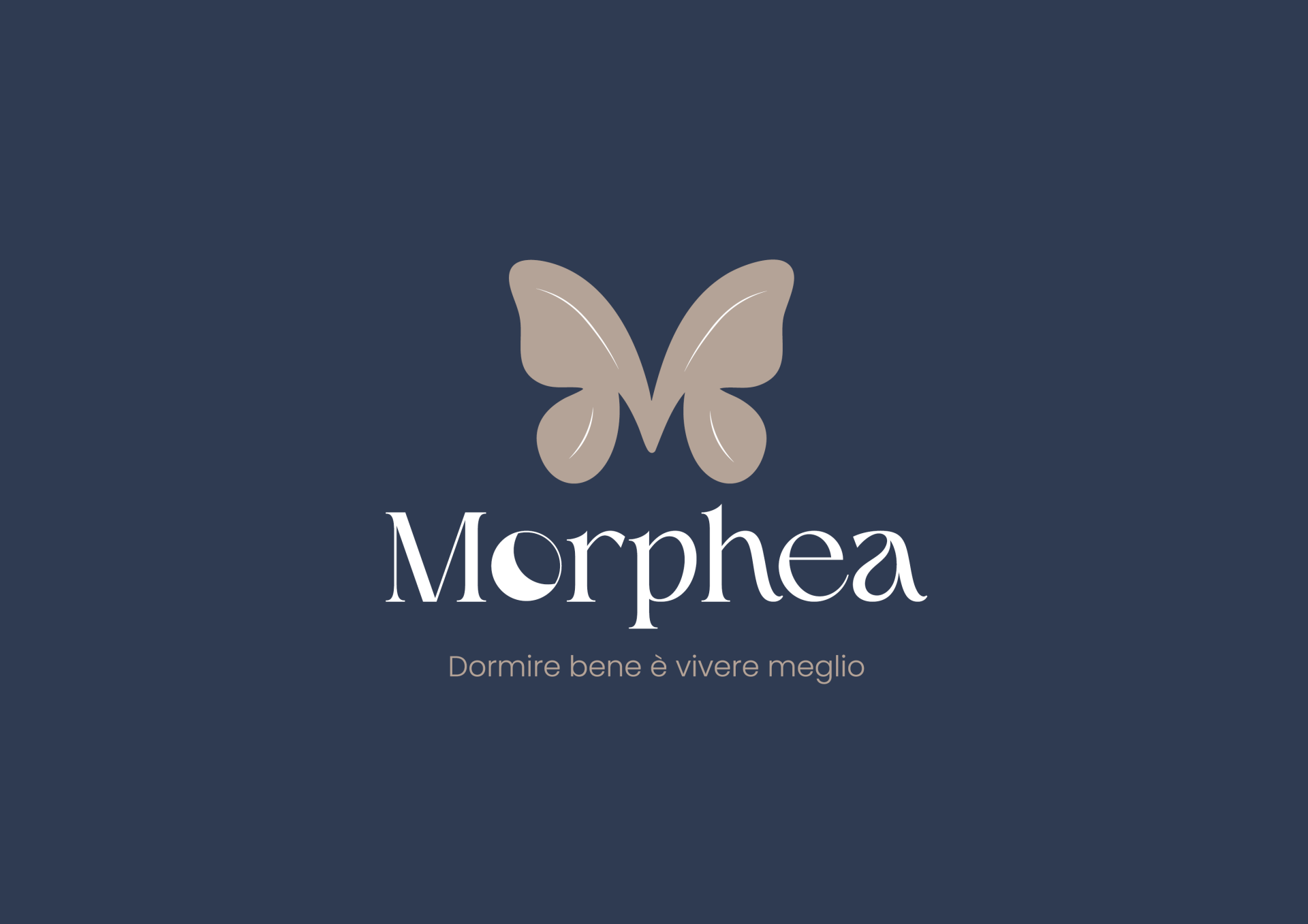
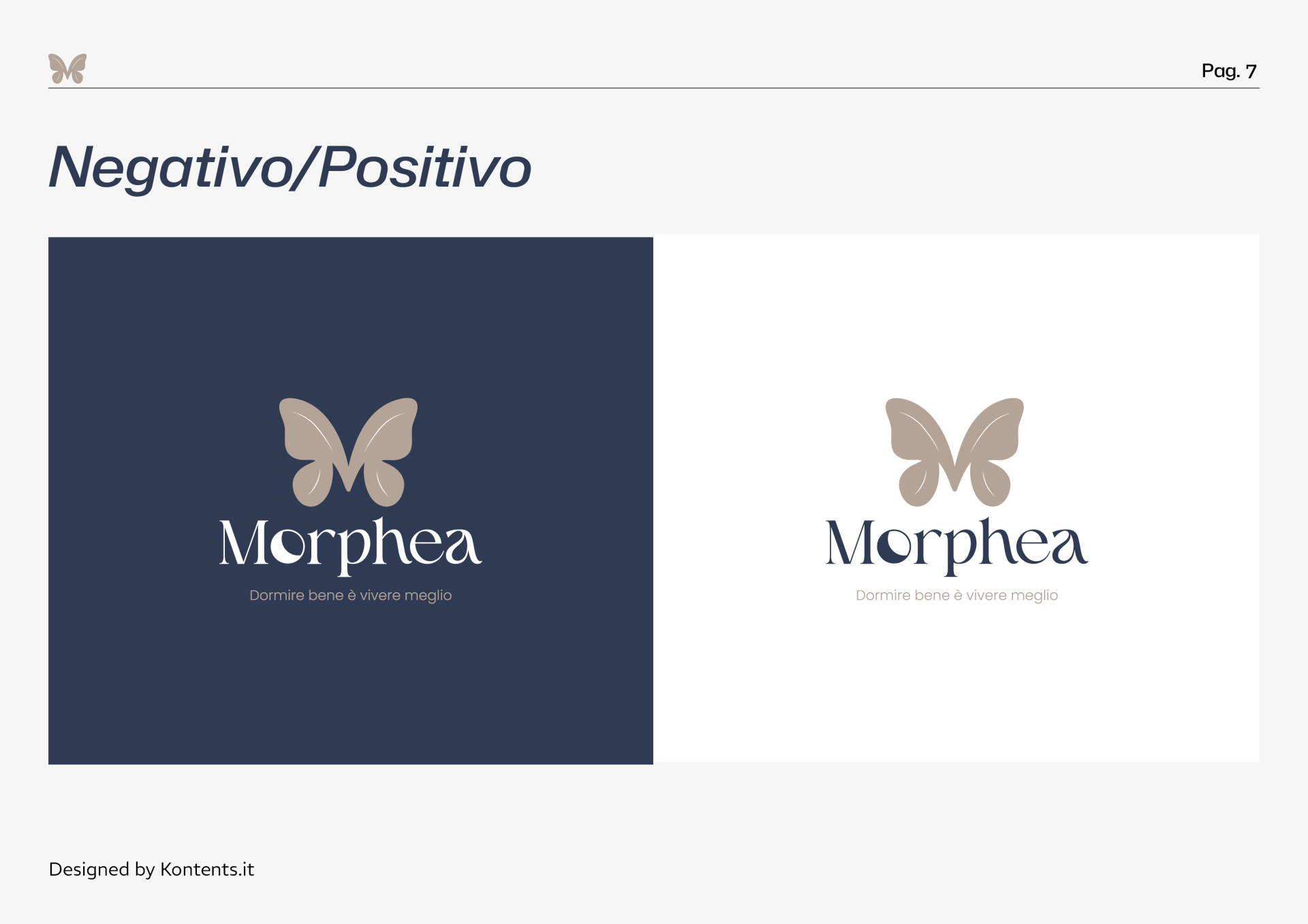
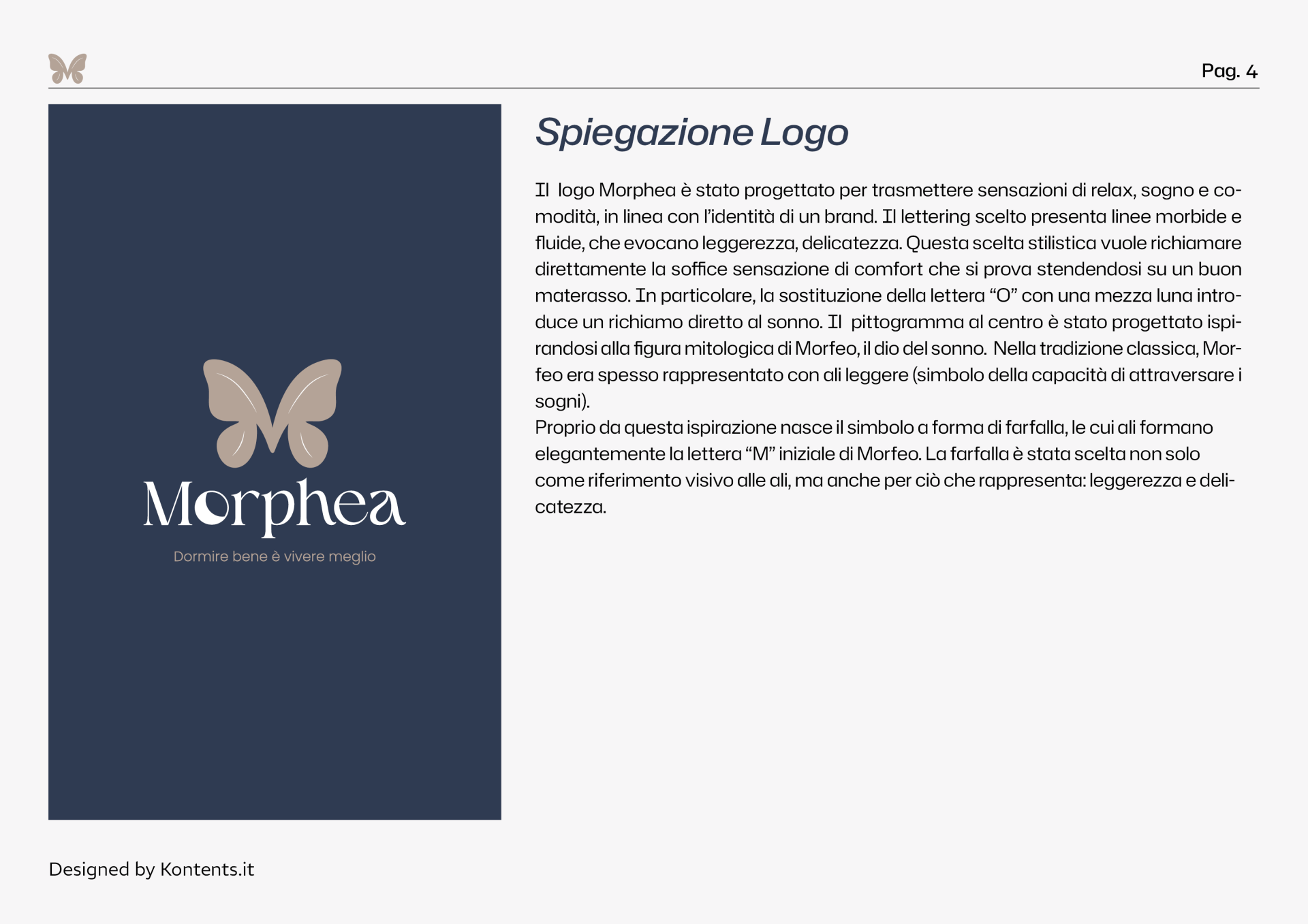
The symbol originates from a butterfly whose wings form the letter M. A sign that recalls the wings of Morpheus and visually translates the concepts of lightness and delicacy.
The logo complements the pictogram with soft shapes and flowing curves. The crescent moon integrated into the letter "o" adds a nod to the night, making the world of rest an integral part of the brand itself.
Colors and typography
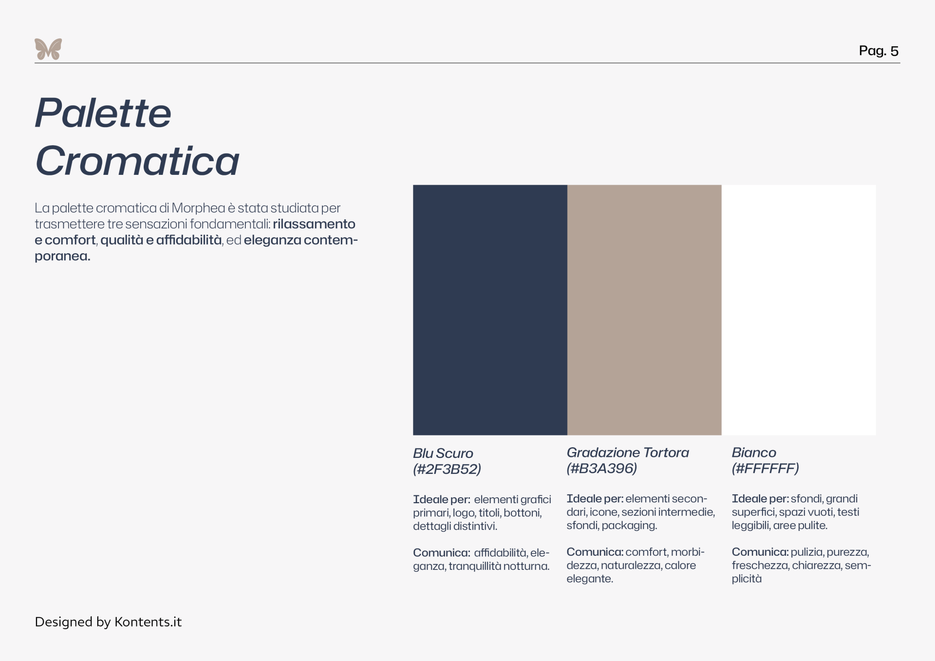
Dark blue, dove gray, and white create a balanced palette: the blue evokes the quiet of the night, the dove gray introduces warmth and softness, and the white gives the composition space and breathing space.
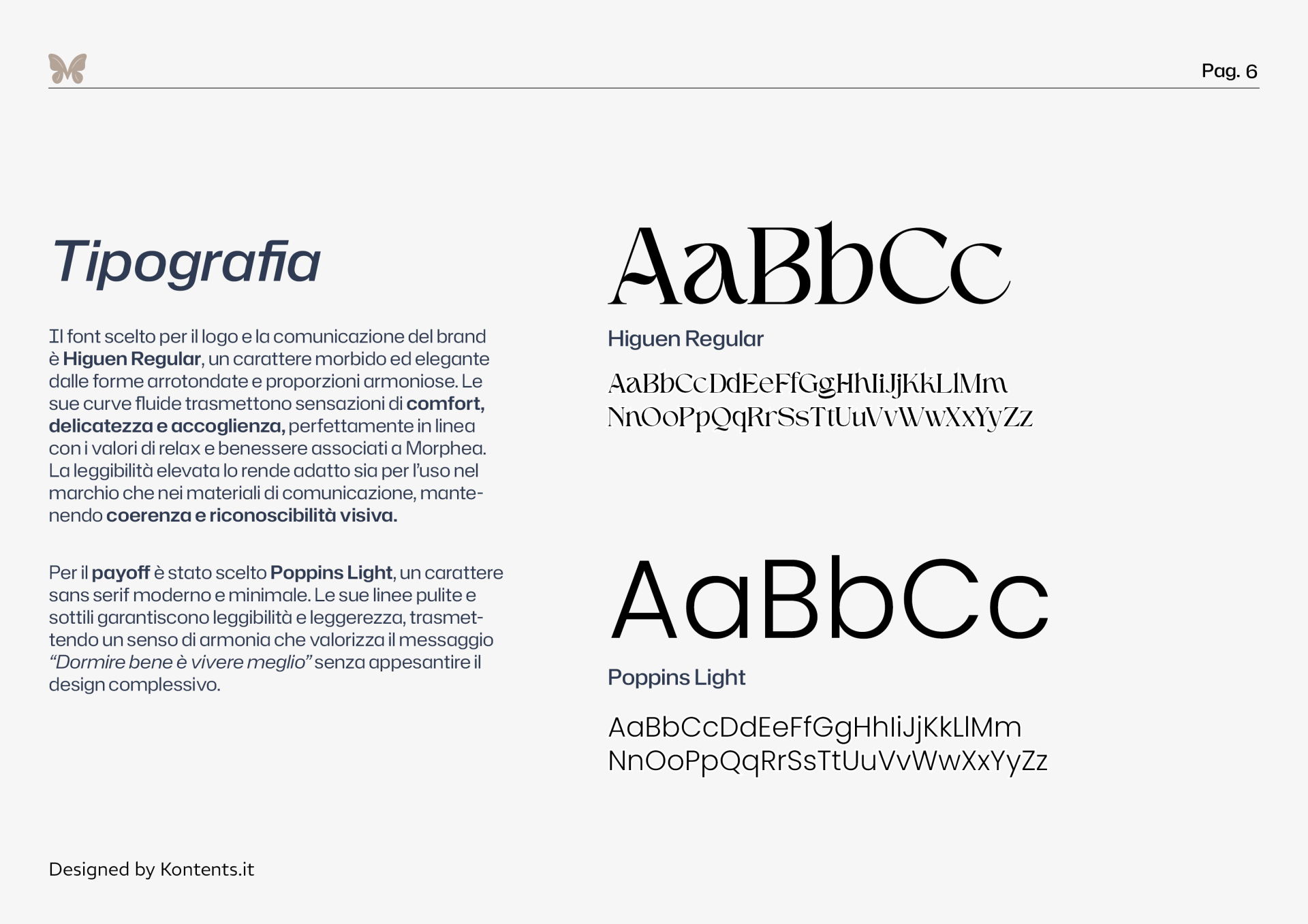
The typography combines the logo's Higuen Regular font with the clean lines of Poppins Light for the tagline. A combination that blends personality and elegance with clear, light-hearted communication.
A coordinated visual system
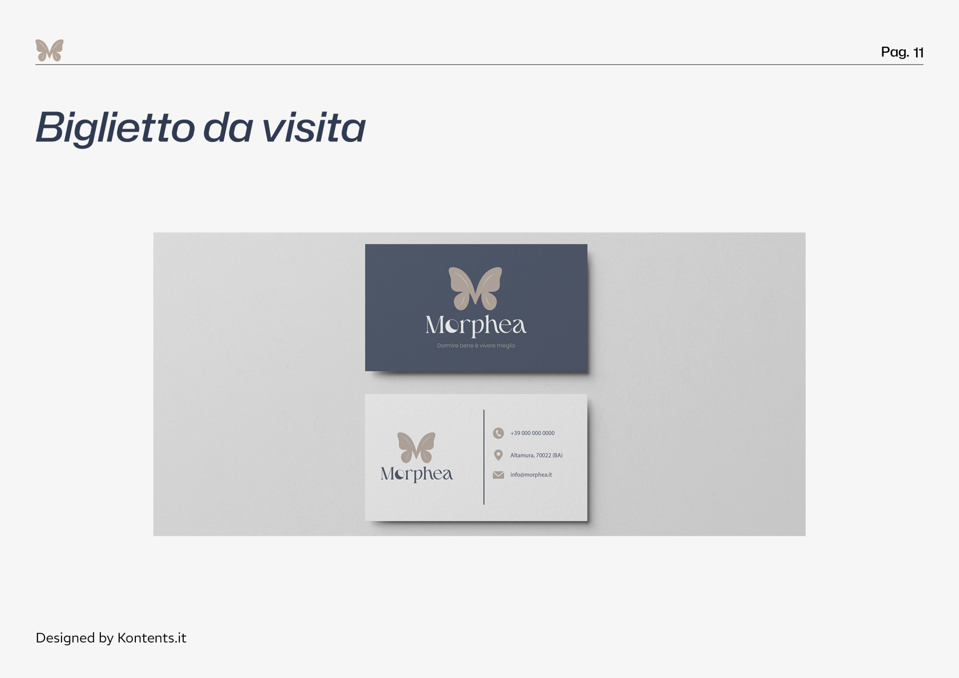
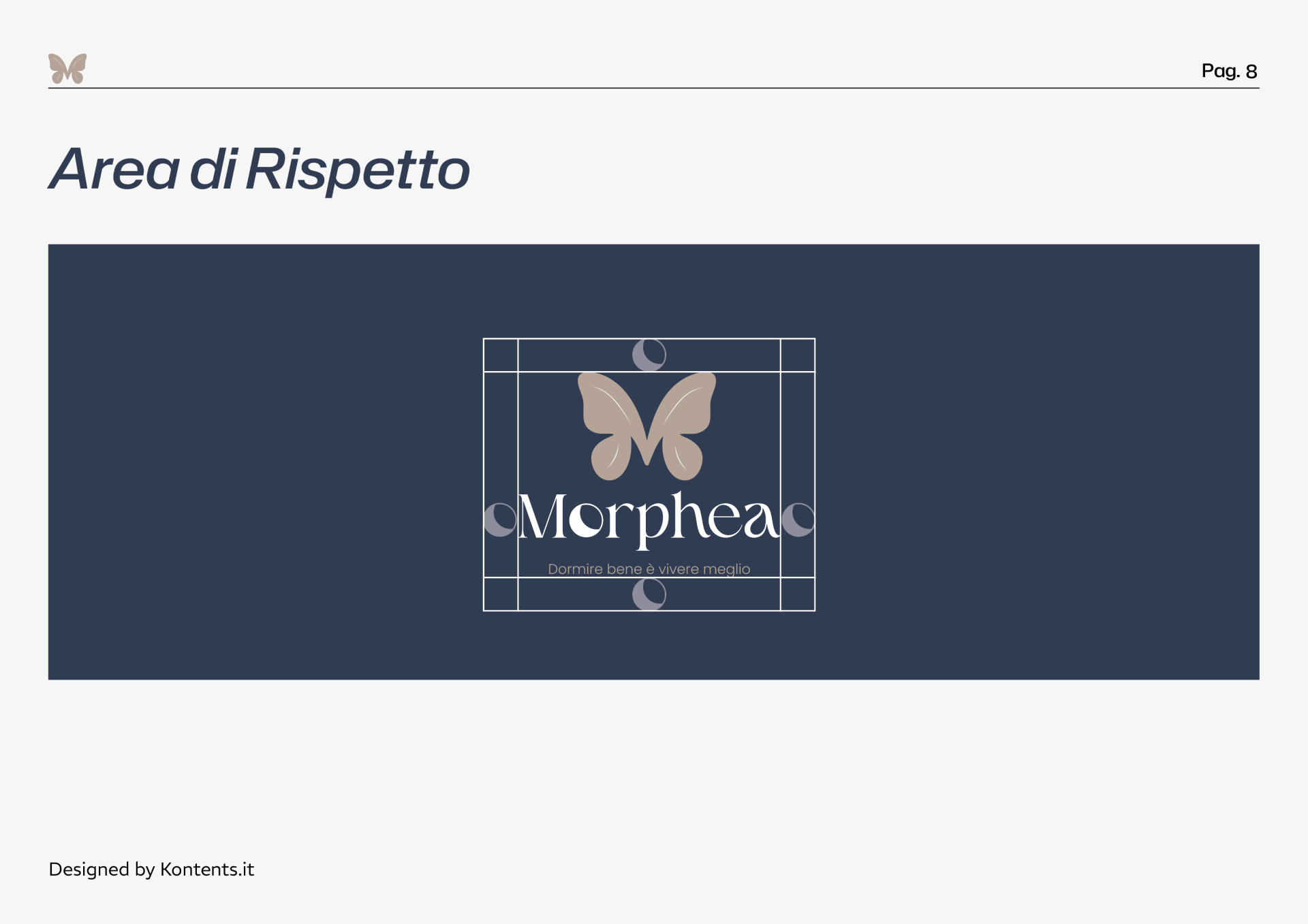
Brand guidelines define colors, typography, logo variations, and clearance areas, providing a consistent foundation for brand applications.
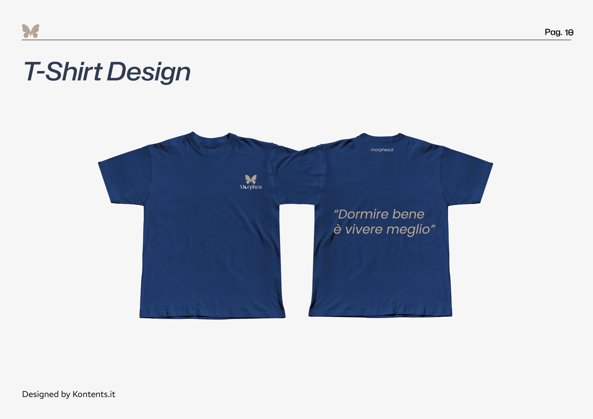
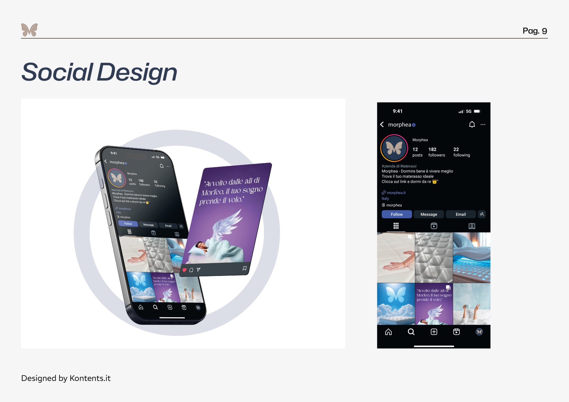
The social design proposals and coordinated T-shirts show how the Morphea identity translates into different communication materials, maintaining a common visual thread.
The name Morphea recalls Morpheus and the universe of dreams. The soft, harmonious sound evokes tranquility and well-being, supporting the brand's premium positioning. From this inspiration, the concept behind the brand's identity was born: translating the lightness of dreams and the welcoming sensation of rest into distinctive shapes, colors, and logos.