


Luca Colonna Fixtures | Brand Identity
An identity that opens new perspectives.
For Luca Colonna Infissi, we designed a brand identity that combines the company name with a logo inspired by its industry. Clean lines, perspective geometries, and a palette of blues and greens create a contemporary image, designed to convey expertise, reliability, and an openness to the future.
The project includes a logo, color scheme, typography, and coordinated applications, accompanied by the tagline “Windows that make the difference.”.
The concept: the name becomes a symbol
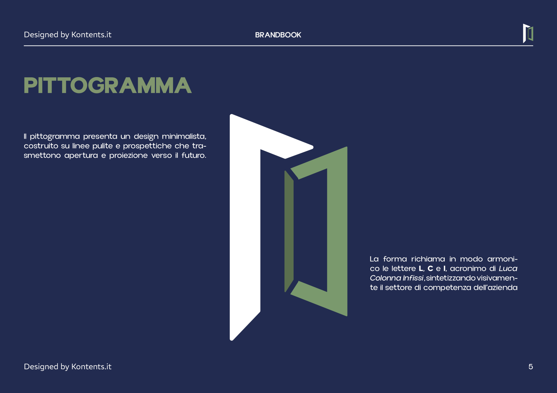
The pictogram integrates the letters L, C and I, initials of Luca Colonna Infissi, in a composition that recalls an open window frame.
The symbol thus links the company name to its field of activity. The perspective lines introduce depth and movement, transforming the reference to the product into a distinctive and recognizable symbol.
An essential and versatile logo
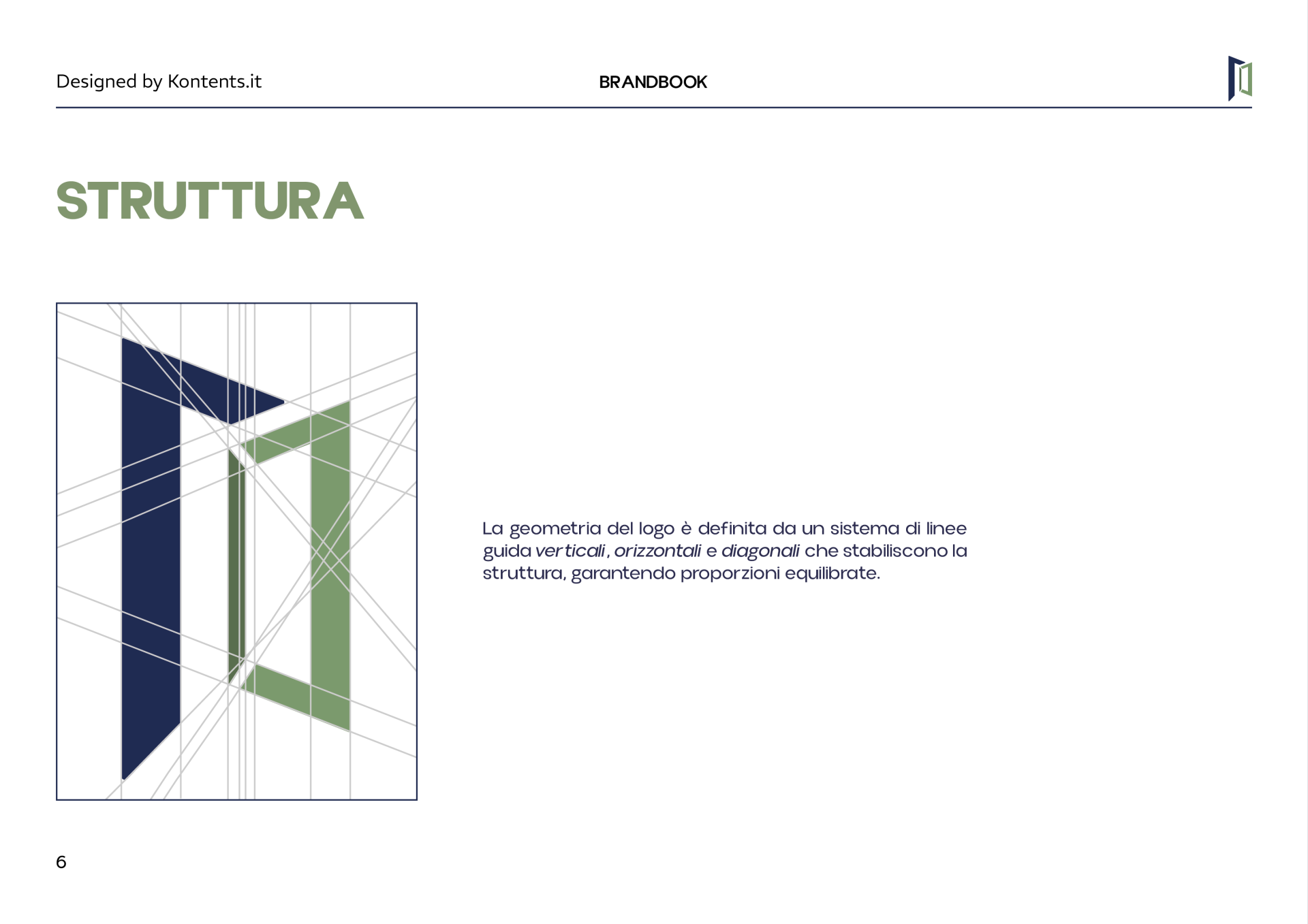
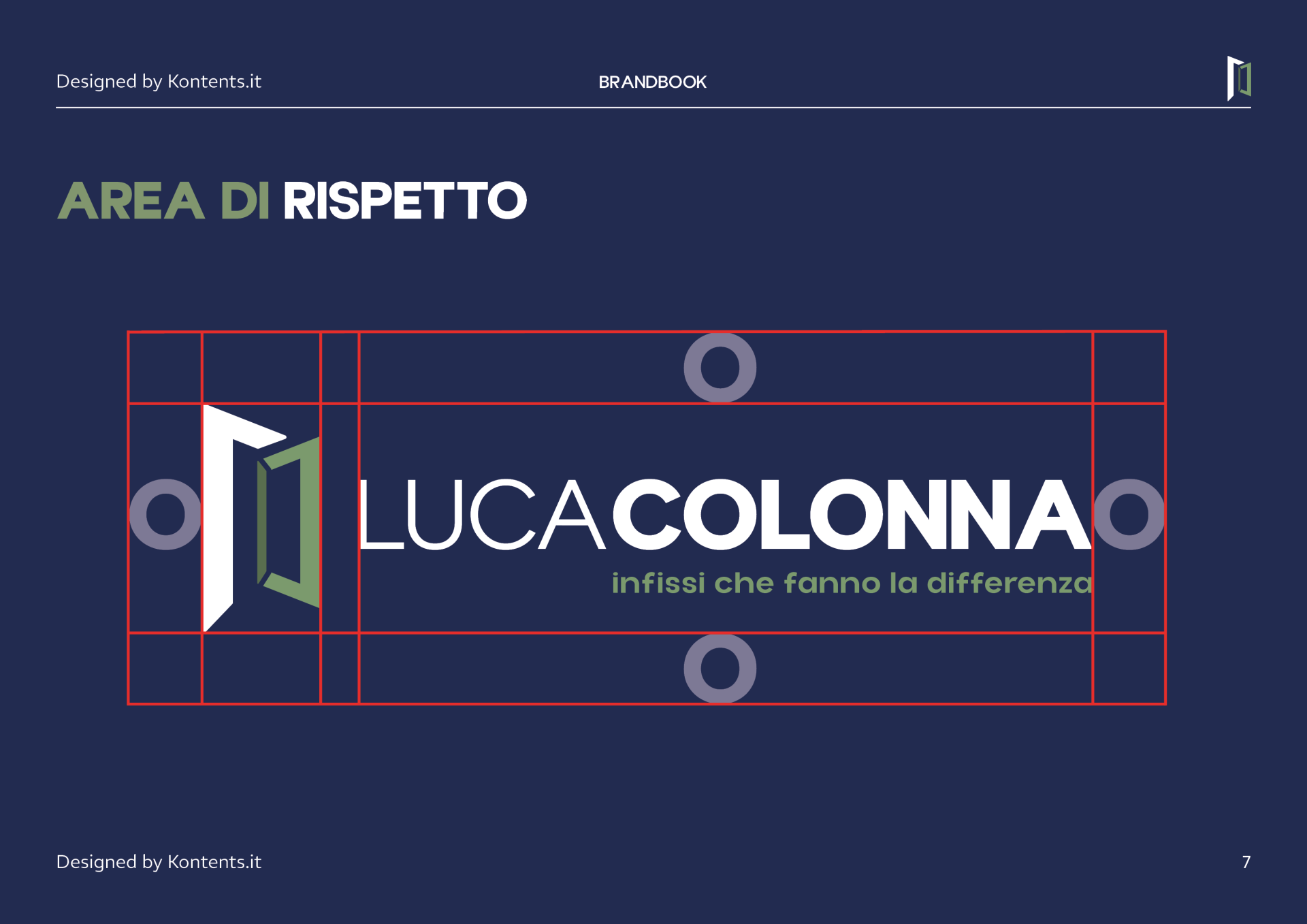
The geometric construction of the pictogram follows a grid of vertical, horizontal and diagonal lines, designed to maintain balanced proportions.
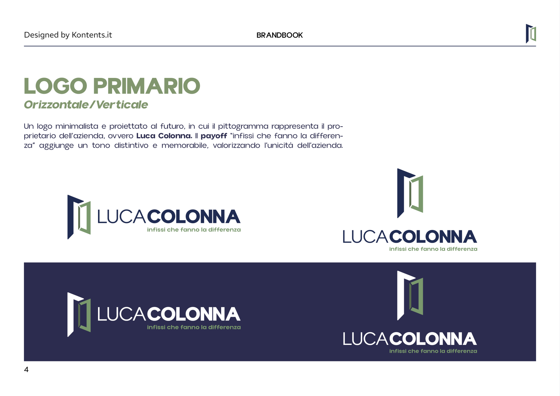
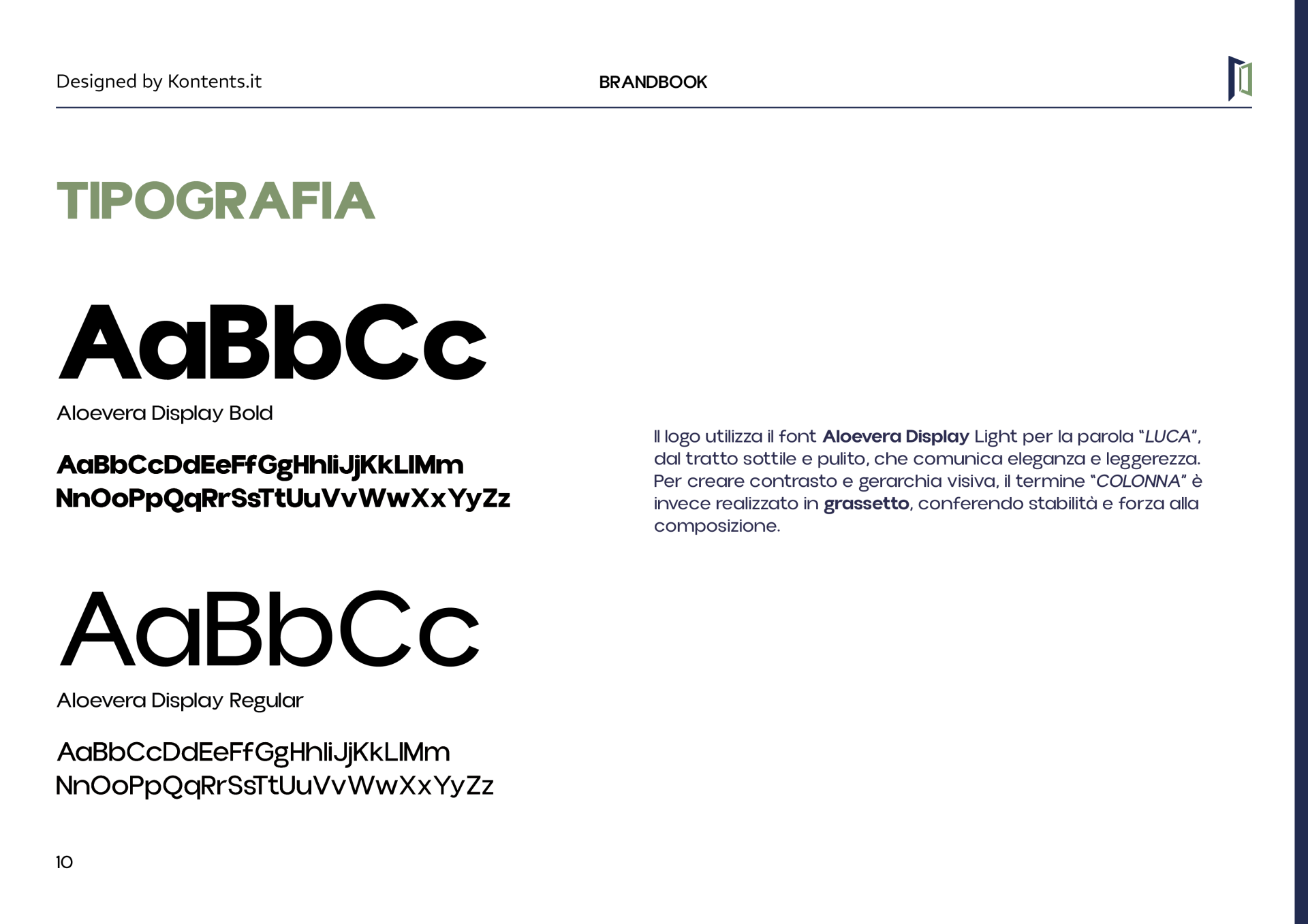
The logo combines two typeface weights: "Luca" features a light stroke, while "Colonna" gains greater visual impact through bold text. This contrast creates a clear hierarchy and enhances the name.
Horizontal and vertical compositions allow the brand to adapt to different formats, maintaining consistency and readability.
Colors and typography
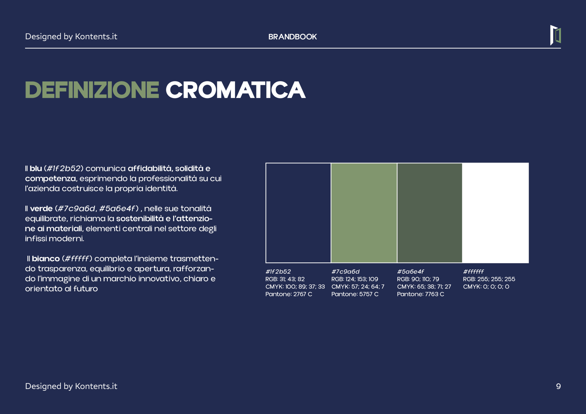
Blue expresses solidity and professionalism. The two shades of green draw attention to materials and the theme of sustainability, while white adds clarity and breadth to the composition.
The Aloevera Display typographic family completes the system with clean shapes and a balance between lightness and visual presence.
An identity applied to everyday communication
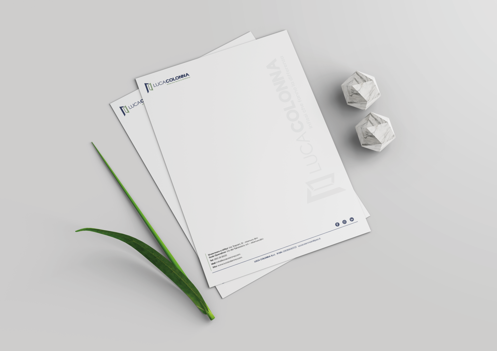
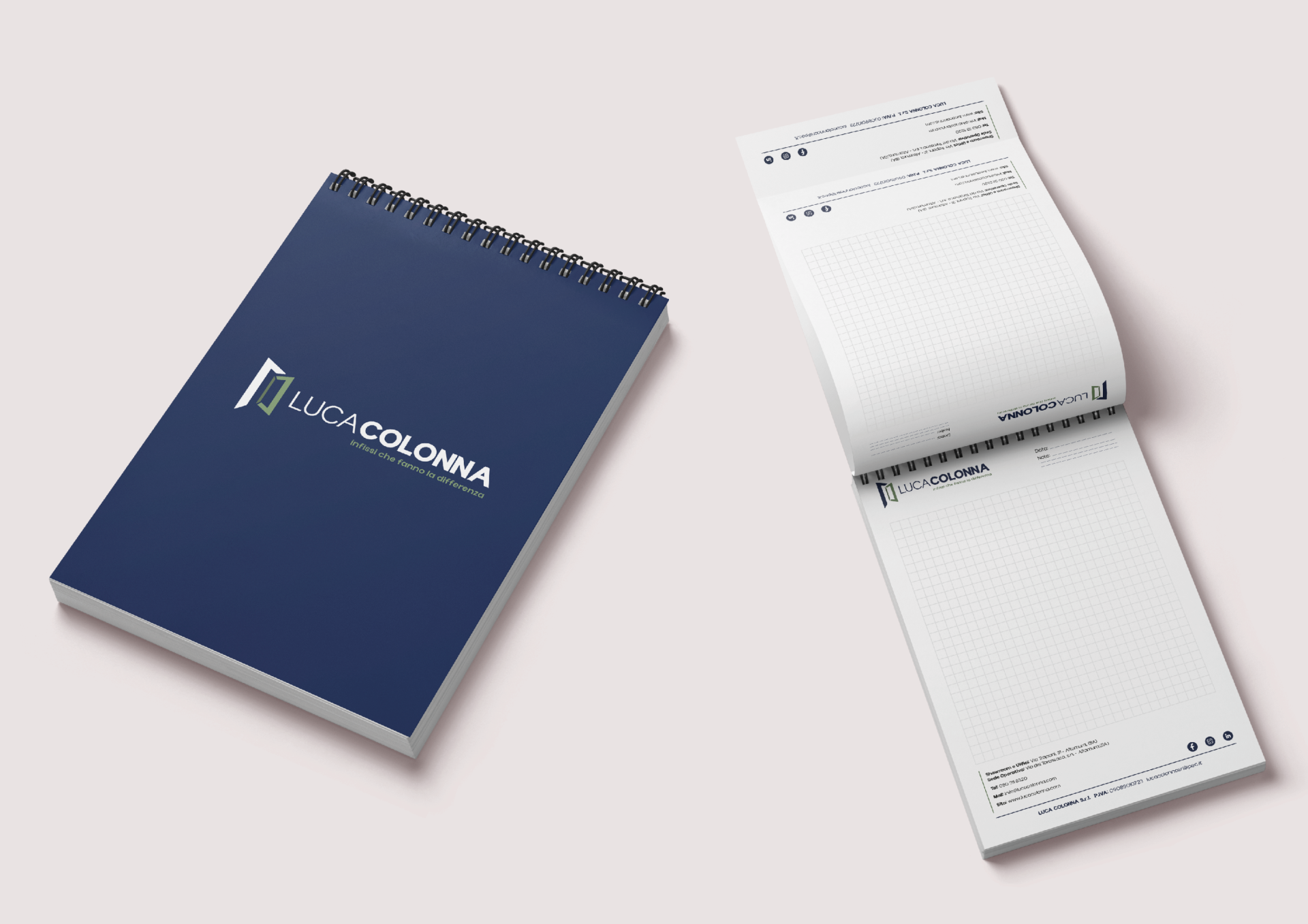
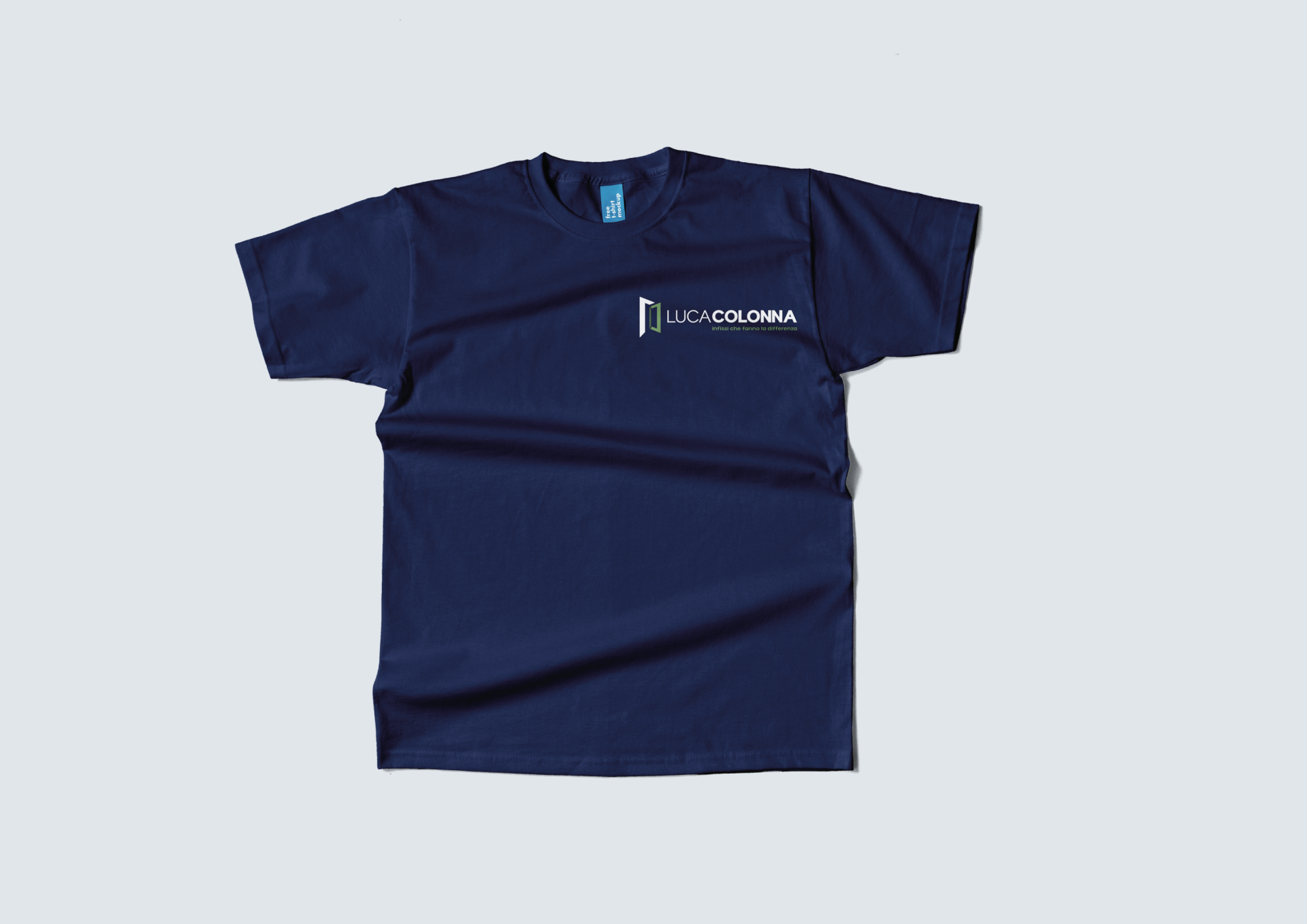
Business cards, letterhead, notepads, and corporate apparel translate corporate identity into coordinated materials. Colors, symbols, and logos become common elements, making the company recognizable in a variety of contexts.
The brandbook includes the logo's structure, variants, clear area, color references, and typography, providing guidance for maintaining continuity in communication.